
We design digital experiences that captivate users, convert prospects, and scale effortlessly. From in-depth user research and interactive Figma prototypes to tokenized design systems and pixel-perfect developer handoff.
Auto-Layout & Living Tokens
Accessible & Inclusive UX
Production-Ready Code Handoff
We reject superficial visual trends that sacrifice usability for vanity. Our design philosophy unites psychological clarity, conversion architecture, and rigorous engineering feasibility.
Every visual element on the screen must earn its place. We reduce cognitive friction with intuitive visual hierarchies, generous whitespace, and unmistakable call-to-action paths.
One cohesive visual language across marketing web pages, customer portals, and native mobile apps. Standardized component libraries eliminate visual debt and build trust.
We design with code in mind. Every auto-layout frame, flexbox property, and responsive breakpoint translates 1-to-1 into CSS, React, or Webflow with zero developer misinterpretation.
From early discovery interviews to validated interactive prototypes, our iterative sprint process ensures every screen is backed by user intent and conversion data.
We immerse ourselves in your customer persona data, competitive landscape, analytics funnels, and stakeholder objectives to identify high-leverage UX opportunities.
Before pushing pixels, we engineer the skeleton: page hierarchy, content strategy, user navigation flows, and interactive low-fidelity grayscale wireframes.
We bring the product to life with tailored typography, curated color palettes, custom iconography, micro-animations, and interactive Figma component states.
We validate high-stakes user journeys with target users, iterate on friction points, and deliver a comprehensive living design system ready for immediate development.
Mobile design is not an afterthought or an awkward shrink of a desktop page. We architect fluid responsive systems that feel native whether viewed on a 4K display, iPad, or smartphone.
Expansive layouts with multi-column grids, rich interactive hover states, contextual sidebars, and high-density data visualizations that take full advantage of large screens.
Adaptive layouts supporting both portrait and landscape orientation with dual touch-and-cursor interaction targets, collapsible sidebars, and fluid clamp typography scales.
Thumb-friendly ergonomics with bottom navigation bars, swipeable carousels, sticky primary CTAs, and frictionless one-handed checkout and sign-up flows.
Stop redesigning buttons and debating padding on every ticket. We build modular, atomic design systems that enable your marketing and engineering teams to launch new features 3x faster.
We structure design variables into global primitives (e.g. Blue-500), semantic tokens (e.g. color-action-primary), and component-specific tokens. Changes propagate across light and dark modes with a single click.
$color-blue-600: #2563eb;
→
SEMANTIC
$bg-action-hover: $color-blue-600;
$space-md: 16px;
→
COMPONENT
$btn-padding-inline: $space-md;
100% Auto-Layout 5.0 components with flexible nested variants for hover, active, focus, disabled, and loading states.
Every component is engineered simultaneously for rich dark theme and clean light theme variants with verified WCAG contrast levels on both.
Inclusive design is both ethical and exceptional business. We design to strict WCAG 2.2 AA and AAA criteria so your product is frictionless for every user, regardless of abilities or assistive tech.
Every typography, button, and icon token is verified against WCAG AAA contrast ratios across all background states, preventing low-contrast eye strain.
WCAG AAA CertifiedDesigned with prominent, accessible focus rings, logical tab order hierarchies, skip-to-content anchors, and intuitive keyboard shortcuts for complex web applications.
Focus Rings & Tab OrdersAll interface transitions and micro-animations include native prefers-reduced-motion alternatives, safeguarding users with vestibular or sensory sensitivities.
Motion Sensitivity SafeVisual layouts map directly to semantic HTML5 heading structures (H1–H6), ARIA landmarks, clear button descriptors, and descriptive alt text annotations.
ARIA & Screen Reader ReadyNo more guessing line heights, missing hover states, or unexported icons. Because we are full-stack developers as well as designers, our handoff files are engineered for immediate implementation.
Every single container in our Figma files uses Auto-Layout with explicit gap, padding, and alignment properties that map directly to CSS flexbox and grid rules.
display: flex; gap: var(--space-4);We provide automated exports of all typography, color, radius, and spacing tokens as ready-to-import CSS custom properties, Tailwind theme configs, or JSON tokens.
tokens.json • tailwind.config.jsWe do not throw files over the fence. Every milestone handoff includes recorded Loom screen tours walking your engineering team through component behavior, edge cases, and animations.
Interactive Specs & Video GuidesWe build high-performance digital products and platforms that drive real commercial results.
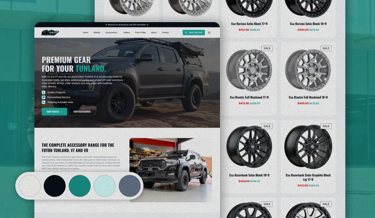
Dedicated 4WD e-commerce platform for Foton Tunland utes built from scratch on WordPress with model-specific fitment verification, dynamic suspension catalogs, and sub-second speed.
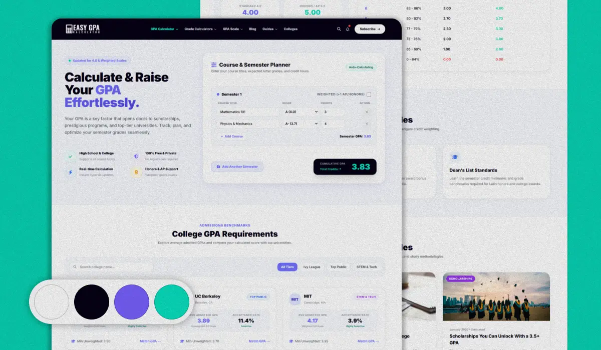
Startup calculation tool and college guide platform for students, re-engineered on WordPress with an in-memory computation engine and full programmatic SEO architecture.
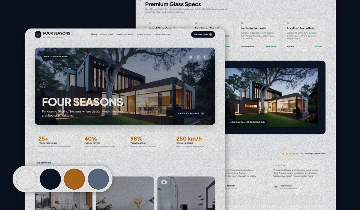
Bespoke custom WordPress platform engineered from scratch for Egypt’s premier architectural glazing fabricator, featuring next-gen WebP portfolio galleries and localized regional SEO.
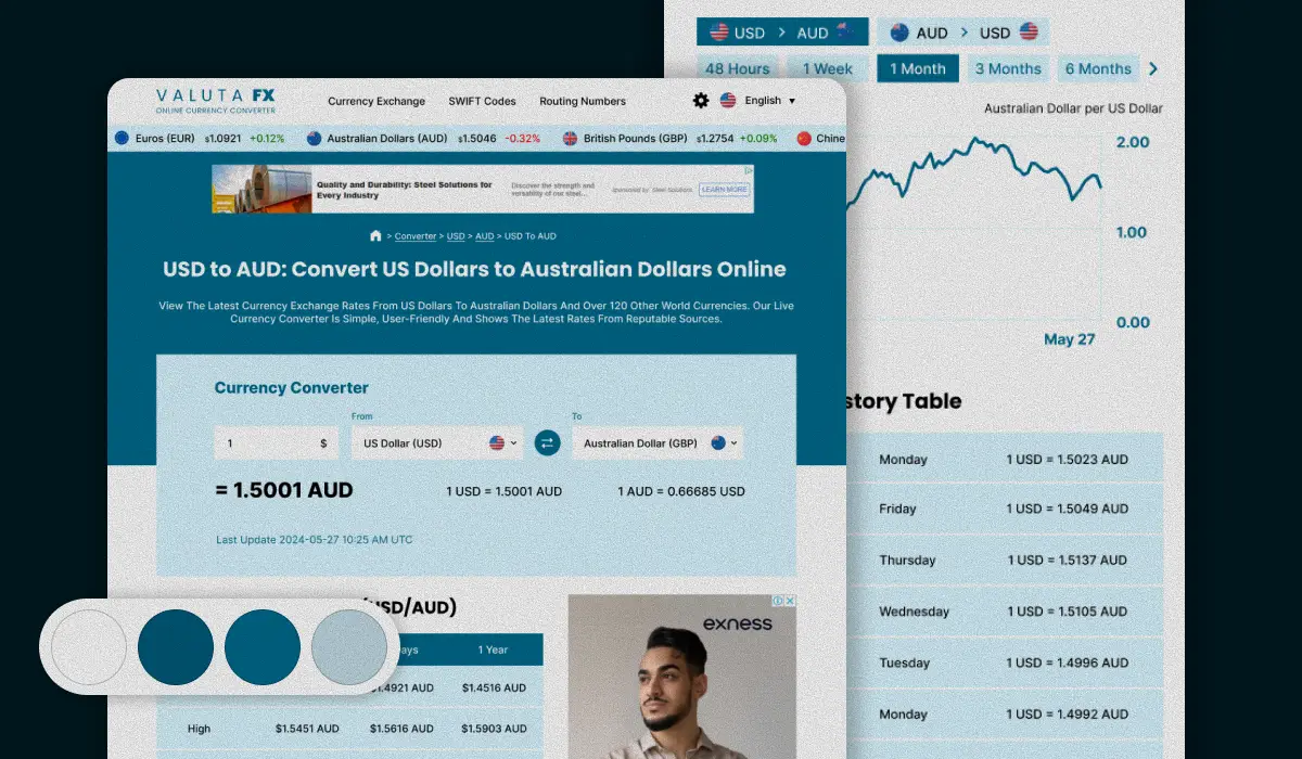
End-to-end UI/UX redesign and logo modernization for a high-traffic global currency converter, engineered with high-contrast fintech components and streamlined conversion flow.
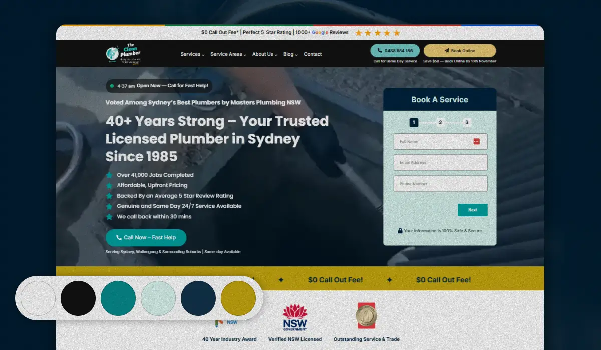
Full digital redesign for Sydney and Illawarra's premier plumbing specialists, engineered for sub-second mobile speed, friction-free booking forms, and high-converting local outreach.
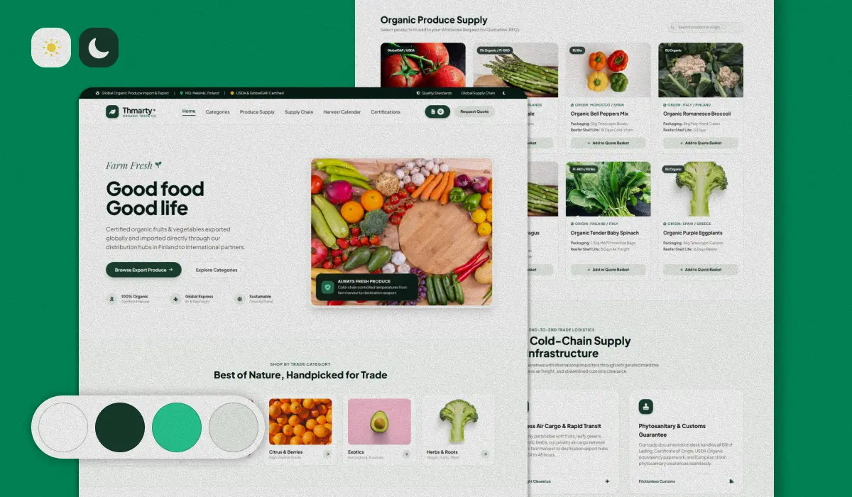
High-performance international trading portal for certified organic vegetables and fruits, featuring wholesale container specifications, EU compliance certifications, and automated B2B RFQs.
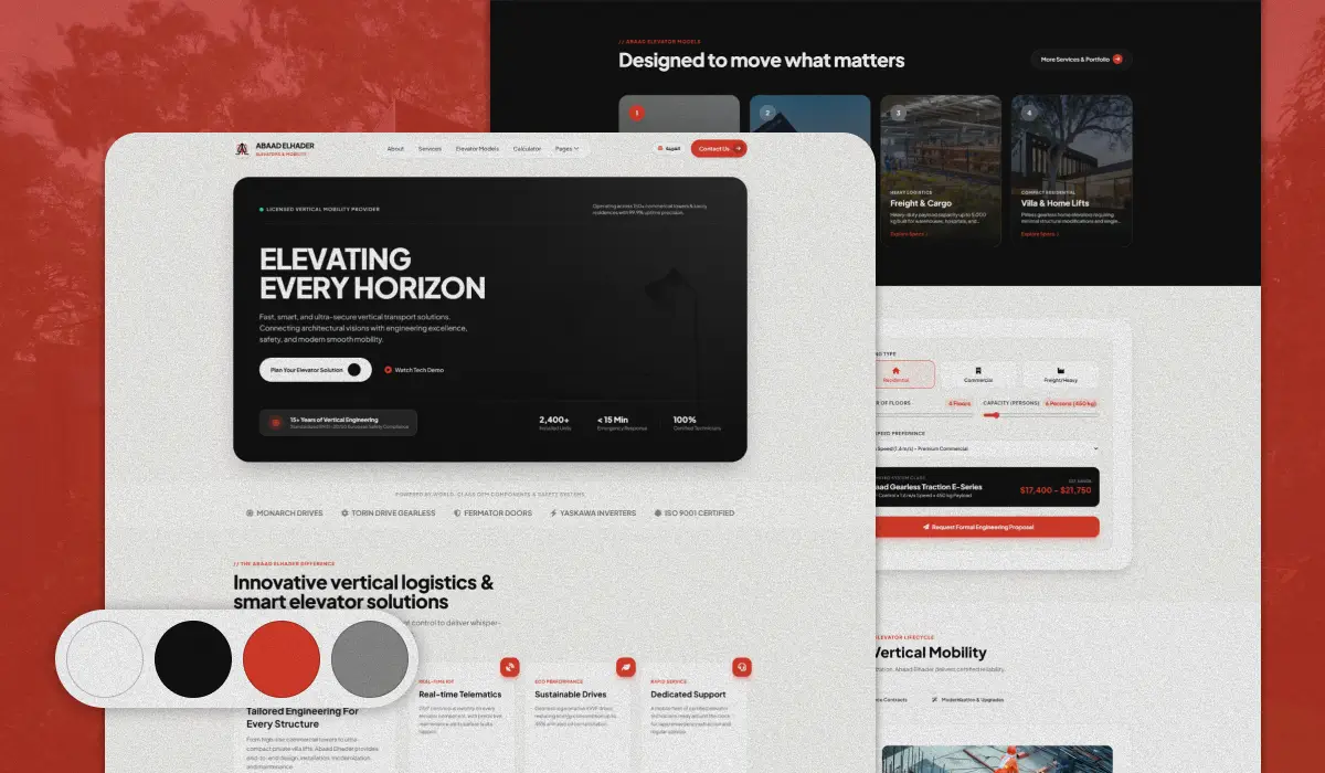
Modern corporate digital presence for an architectural elevator and mobility engineering leader, featuring interactive lift configurators, technical specifications, and luxury project showcases.
Trusted by clients who value quality and results.

"The Tunland 4x4 website has already made its first sale! We're so happy with the results. Thank you for all your help and support. Alaa did an amazing job bringing the vision and direction to life."


"Working with Code1001 made a huge difference for my clinic. The website is clean, loads fast, and patients find it very easy to book their sessions online. Alaa really listened to what we needed and delivered ahead of schedule."

"We're getting a lot of compliments on the new website, and we already received several quote requests through WhatsApp in the first week. Alaa was super helpful, patient, and delivered exactly what we asked for. Thank you so much!"

"Managing my student groups and teaching schedule used to take up hours of paperwork every week. Abdelrahman from the Code1001 team built a custom app that organized everything—classes, timings, and student tracking—in one simple place. It made my daily work so much easier. Thank you so much Abdelrahman and the Code1001 team!"

"Code1001 helped us take Step Up Academy to the next level. They created beautiful designs for our brand and automated our student registrations and daily follow-ups. What used to take hours of manual work every day now runs smoothly. Thank you so much for the wonderful work and continuous support!"
Clear answers regarding our Figma workflow, design system ownership, developer handoff assets, revision protocol, and project timelines.
Our lead product designers are available for a 30-minute scoping session to review your existing UX, Figma files, or product wireframes.
Consult a Senior Product Designer →Our primary design workspace is Figma. We build all projects with 100% native Figma features: Auto-Layout 5.0, Component Sets with interactive variants, variable tokens for colors and typography, and interactive clickable prototypes. We also use FigJam for collaborative wireframing and user journey workshops.
You own 100% of all design files, Figma team libraries, component tokens, custom vectors, and creative assets upon project settlement. We transfer full ownership of the Figma projects directly into your organization with zero ongoing licensing fees.
Because our studio consists of senior developers as well as designers, we know exactly what engineers need. We organize our Figma files with clean dev-mode annotations, explicit spacing tokens, exported CSS custom properties, and recorded Loom video walkthroughs explaining tricky edge cases and micro-animations.
A focused marketing website redesign or landing page suite typically takes 3 to 5 weeks. A comprehensive enterprise web application or complex multi-tenant SaaS redesign with a full design system typically spans 6 to 10 weeks across iterative agile sprints with weekly review meetings.
We work in tight collaborative feedback loops. You can leave direct Figma comments on specific frames or components at any time. Every sprint includes structured revision rounds before proceeding to the next fidelity stage, ensuring you are never surprised by the final design.
Yes! Code1001 is a full-service digital agency. We can seamlessly transition your approved designs directly into production code using Webflow, WordPress, Shopify, Next.js, or custom React applications with 100% fidelity to the approved Figma files.
Share your existing product, wireframes, or new brand vision. You will receive an expert UX audit, design sprint roadmap, and comprehensive proposal within 48 hours.